WELLNESS RETREAT BRANDING
A warm + lively brand identity for Wild Thing— a women’s wellness retreat helping burntout women slow down and reconnect with themselves.
THE VISION
We started with a vision of giving women a place to step away from the pace of everyday life, make space to unwind, and come home to themselves. The brand needed to feel natural and grounded, just like the retreat destinations, but still lively / feminine / full of personality. Wild without losing the feeling of being welcomed and cared for.
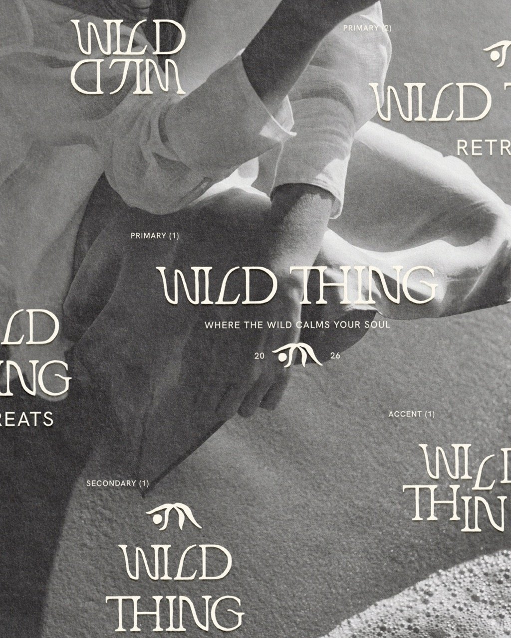
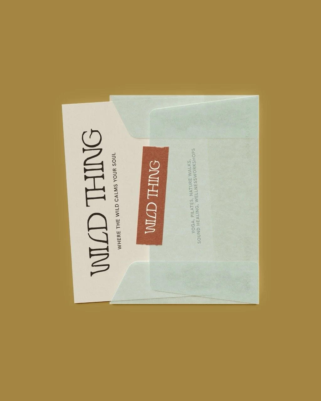
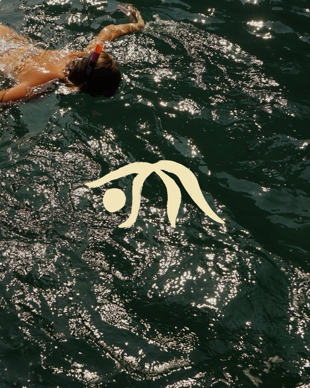
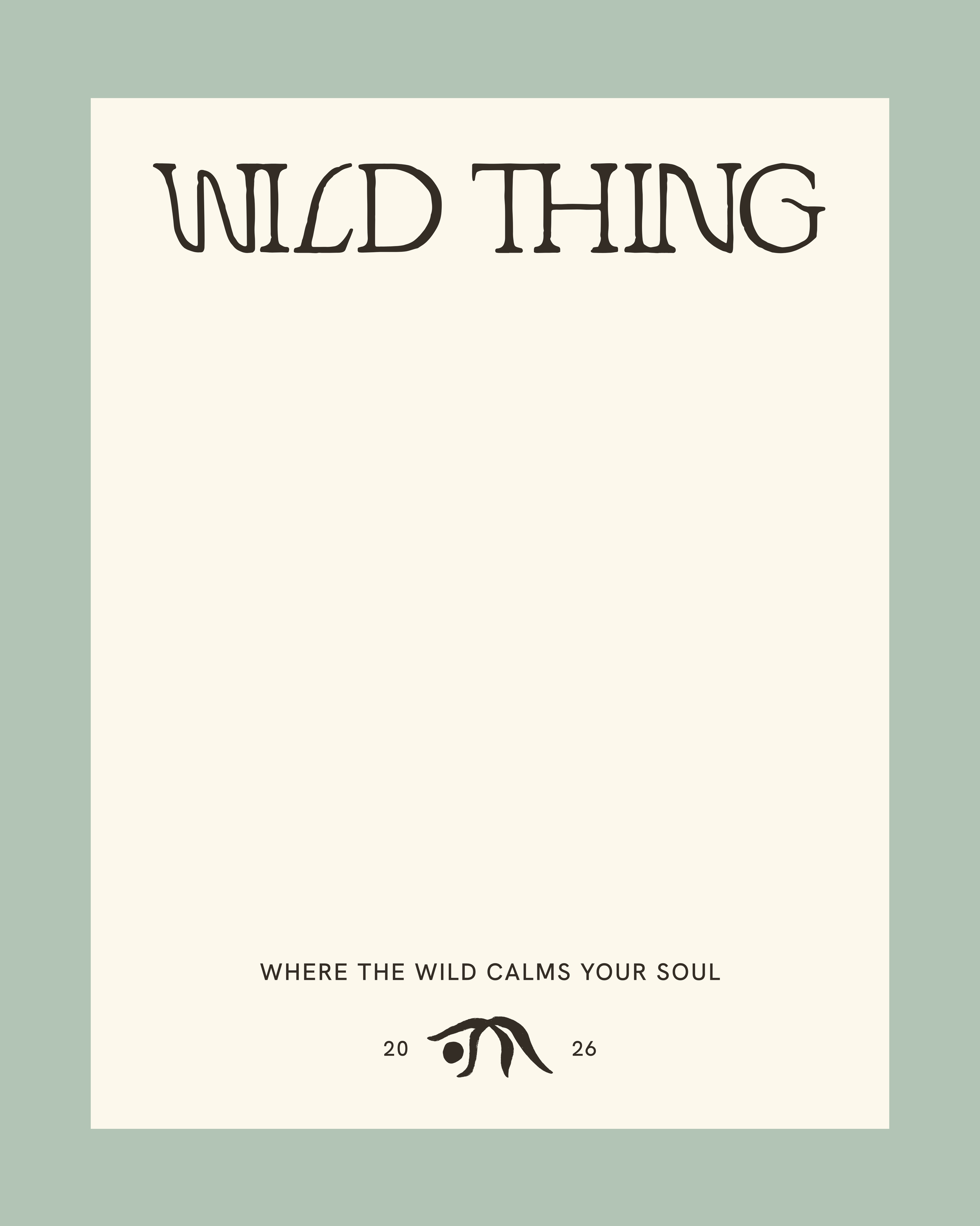
Building the foundation for a retreat women would want to escape to. We defined the feeling behind Wild Thing, who it's for, and what would make the experience different. From there, we built a complete visual identity with a flexible logo suite, custom brand mark, expressive typography, and a warm, earthy color palette, giving Wild Thing a clear visual world to build from as the retreats and community grow.
lively
refreshing
transformative
belonging
grounding
golden
clean
natural
THE FIRST CHAPTER
BRAND WORDS
caring
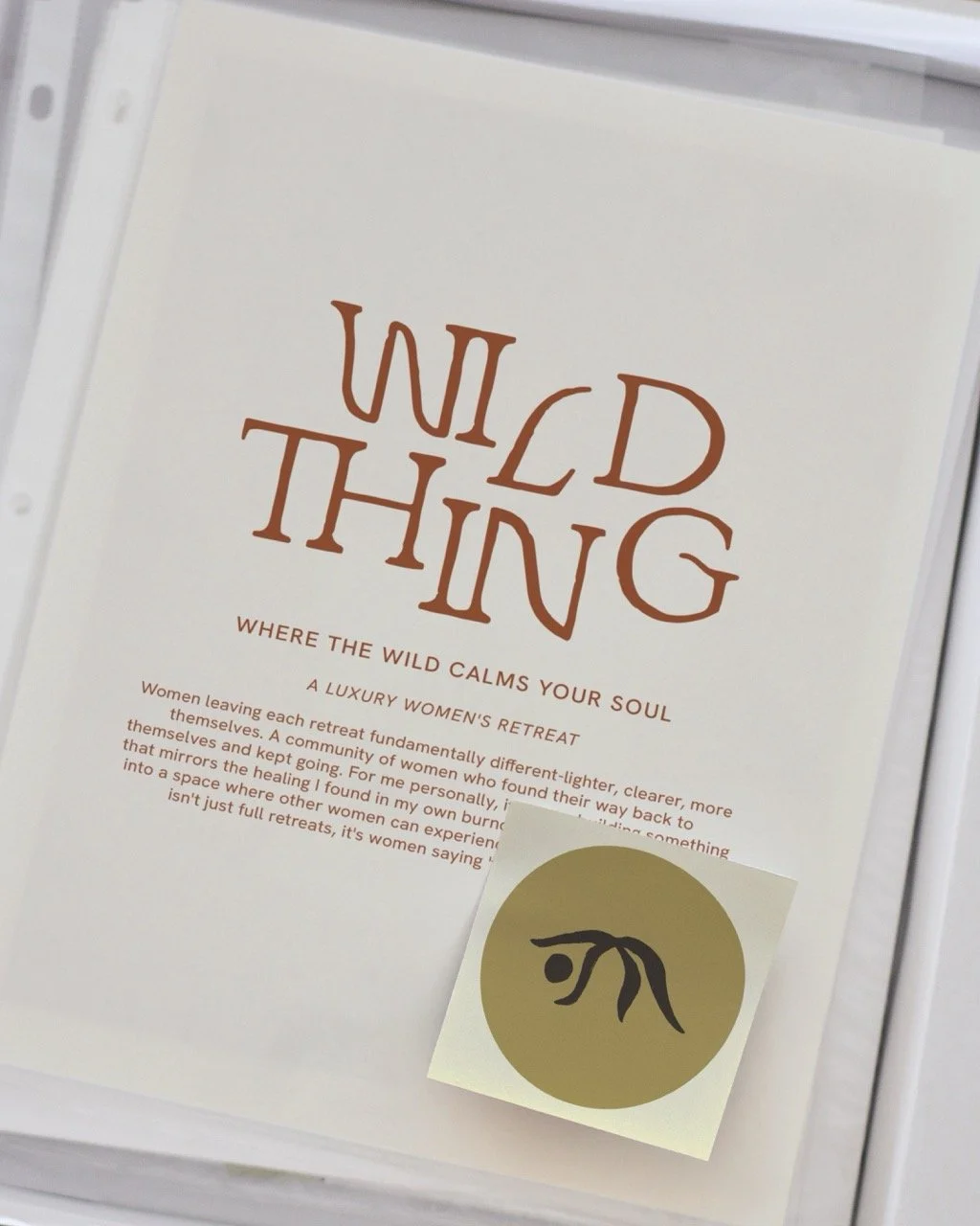
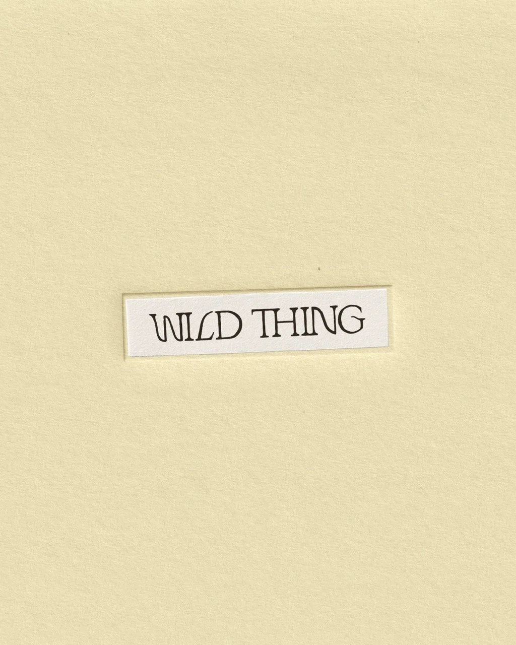
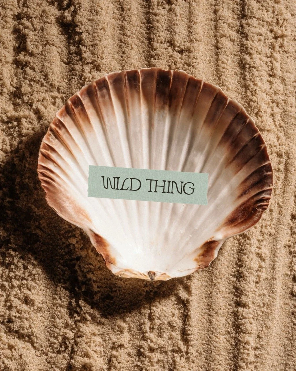
Wild Thing is about how you feel when you leave the retreat: lighter, clearer, and more in tune with yourself. We used that feeling to guide the rest of the brand, using golden hour colors + earthy textures + organic shapes + expressive details to create a world that feels warm, wild, and a little imperfect.
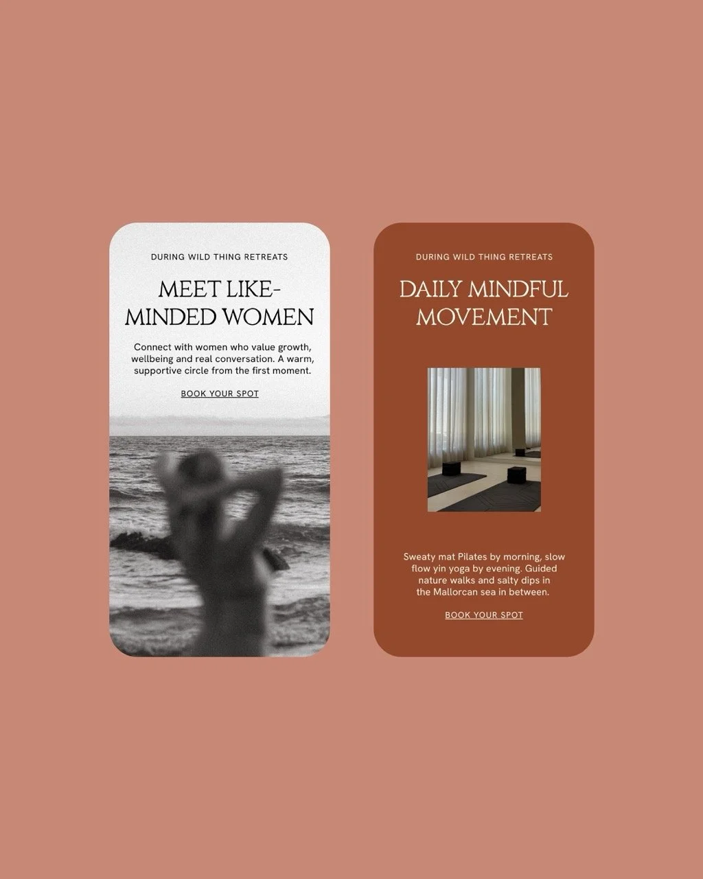
While discovering the retreat online and experiencing it in person, the brand is designed to make women feel like they've stepped somewhere completely different from everyday life.
THE EXPERIENCE
IN THEIR WORDS
“From our very first conversation, she understood exactly what I was trying to build with Wild Thing Retreats. She took that feeling and turned it into a brand I genuinely love. Every detail feels intentional, considered and true to what this brand stands for.” — Roxy Yasbek